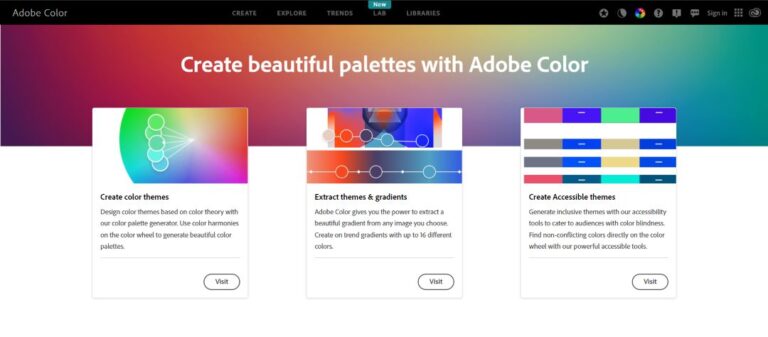
Adobe Color
A web-based tool for creating color schemes based on different color harmony principles.
Click here 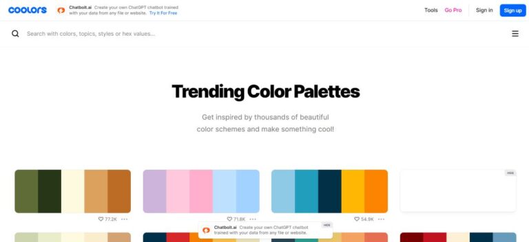
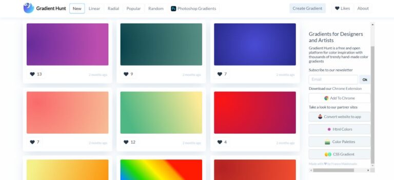
Gradient Hunt
A platform for discovering beautiful gradients created by designers worldwide.
Click here In the realm of graphic design, colors are more than mere visual elements; they are powerful tools that convey emotions, messages, and identities. For a freelancer in graphic design, mastering the art of color combinations and gradients is essential to creating visually appealing and impactful designs. This comprehensive guide will explore the principles of color theory, practical tips for combining colors, and how to effectively use gradients to enhance your projects.
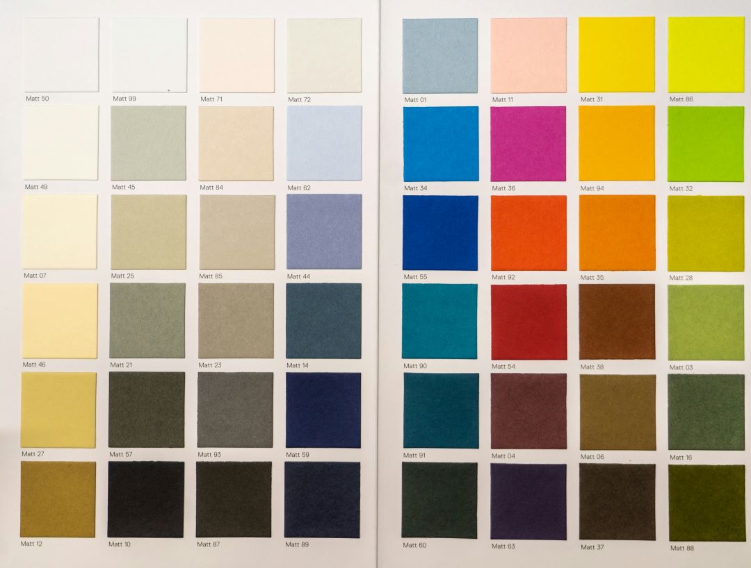
Before diving into color combinations, it’s crucial to understand the basics of color theory. The color wheel, developed by Sir Isaac Newton in 1666, remains a fundamental tool for designers. It consists of primary, secondary, and tertiary colors, which can be combined in various ways to create harmonious designs.
– Primary Colors: Red, blue, and yellow.
– Secondary Colors: Green, orange, and purple (created by mixing primary colors).
– Tertiary Colors: Combinations of primary and secondary colors (e.g., red-orange, blue-green).
Color harmony refers to the pleasing arrangement of colors. Here are a few key principles to consider:
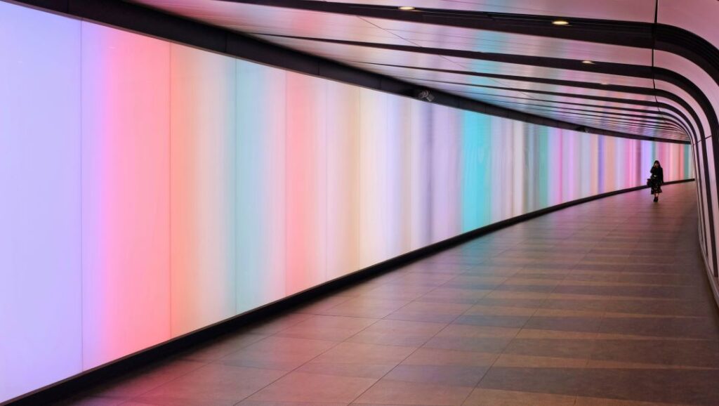
Gradients, the gradual blending of one color to another, add depth and dimension to your designs. Here’s how to effectively use them:
For a freelancer in graphic design, mastering color combinations and gradients is not just about following rules but understanding how colors interact and the emotions they evoke. By applying the principles of color theory, experimenting with different combinations, and utilizing gradients effectively, you can elevate your designs and create visually stunning projects that captivate your audience.
Whether you’re working on branding, web design, or digital illustrations, the strategic use of colors will set you apart and enhance the impact of your work. So, dive into the world of colors, experiment fearlessly, and let your creativity shine.
—
By following this comprehensive guide, you’ll gain the skills needed to master color combinations and gradients.